Background
What do you get when you cross a stage manager, a to-do list, and a digital platform? Either a really organized show or a really confused computer! We aimed for the first one with Thank You, Five - turning the chaos of theater production into a well-oiled digital machine. Because let's face it, the only drama should be on stage, not in your project management!
The Challenge 🎯
Our client came to us with a website that was about as exciting as reading stage directions in monotone. They wanted:
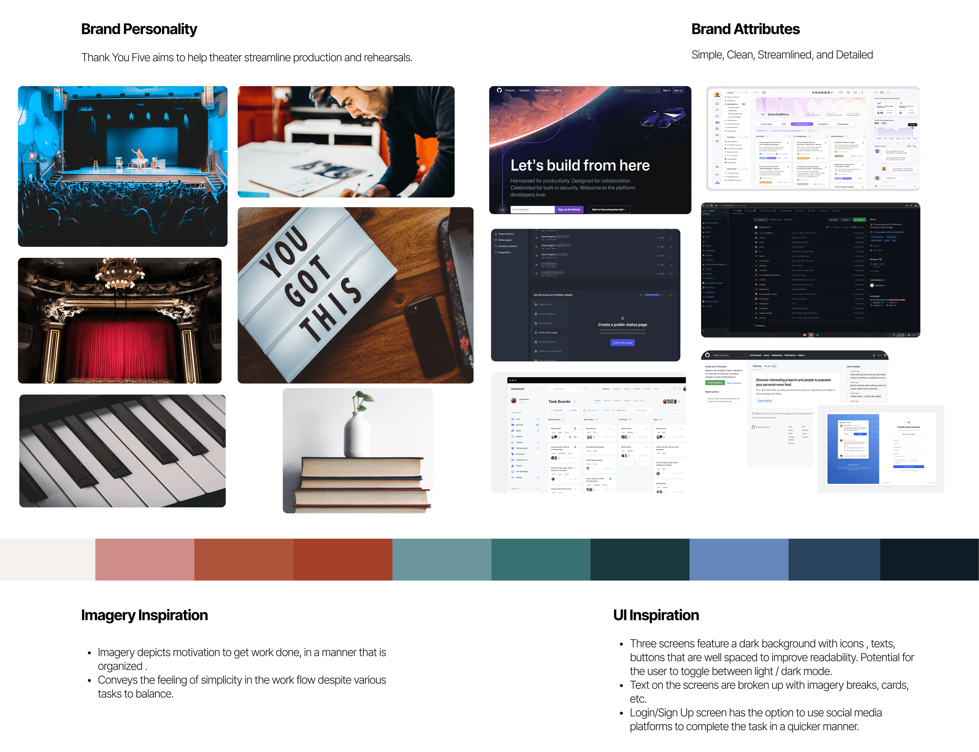
A complete design makeover (GitHub's dark mode was their inspiration, because apparently developers and theater folks both love working in the dark!)
A logo that didn't look like it was designed during intermission
A way to manage theater productions without needing a production team to manage the management tool
Something they'd love more than their coffee during tech week (and that's saying something!)
The Journey 🚀
1. Setting the Stage: Discovery 🔍
First, we needed to become theater experts faster than an actor learning replacement lines:
Got a virtual tour of the current website (spoiler: it needed more than just a costume change)
Became fluent in theater-speak (turns out "break a leg" isn't great UX advice)
Studied the competition like we were understudying their lead roles
Learned enough theater terms to fake our way through a Broadway interview
2. Plot Development: Ideation 📝
Our user stories were like a playbill, but with fewer advertisements:
The Grand Entrance: Account Creation (no spotlight required)
The Return Performance: User Login (standing ovation optional)
The Main Event: Project Creation (this time with less dramatic tension)
The Rehearsal Schedule: Time Management (because "fashionably late" isn't in a stage manager's vocabulary)
3. The Production: Design Process 🎨
Act 1: Medium-Fi Wireframes
Our first drafts were like early rehearsals - a bit rough around the edges:
Each designer took their part (no auditions required)
Discovered we needed more ensemble work (just like that one person who sings louder than the chorus)
Pivoted to single-production management (because juggling shows is best left to circus performers)
Act 2: UI Deep Dive
The home screen needed to be our star performer:
Everyone brought their best design to the stage
Held a UX workshop that was less dramatic than a theater callback
Client picked option two (after fewer revisions than a Shakespeare adaptation)
Added darker colors because apparently both developers and theater folks are vampires
Act 3: Style Guide Spectacular
Created a look that would make Broadway jealous:
Embraced GitHub's dark mode (because squinting at bright screens is so last season)
Built a component library more organized than a prop master's storage
Created a typography system even the most particular director would approve

4. The Plot Twist 🎭
Waiting for client feedback was like waiting for your cue in the dark - nerve-wracking and slightly confusing! But we:
Kept designing like the show was tomorrow
Explored more options than a method actor preparing for a role
Stayed more flexible than a dancer in the chorus line
Lessons Learned 💡
One production at a time (unlike a certain theater major's dating life)
Different roles need different access (just like backstage passes)
Client communication is key (who knew theater folks were busy?)
Adaptability beats perfectionism (unless you're the lighting designer)
The Reviews Are In! 📈
Our final product was a bigger hit than a surprise musical number:
Interface smoother than a well-rehearsed quick change
Project management tools sharper than a stage manager's pencil
Permissions clearer than a director's vision
A design the client loved (no encore needed!)
What's Next? 🎬
Ready for:
Real-world testing (scarier than opening night)
Feature expansions (like a show's running time)
Future integrations (more crossovers than a Broadway mashup)
Remember: In theater, they say "the show must go on!" In UX design, we say "please don't refresh the page, we haven't saved yet!" 😅