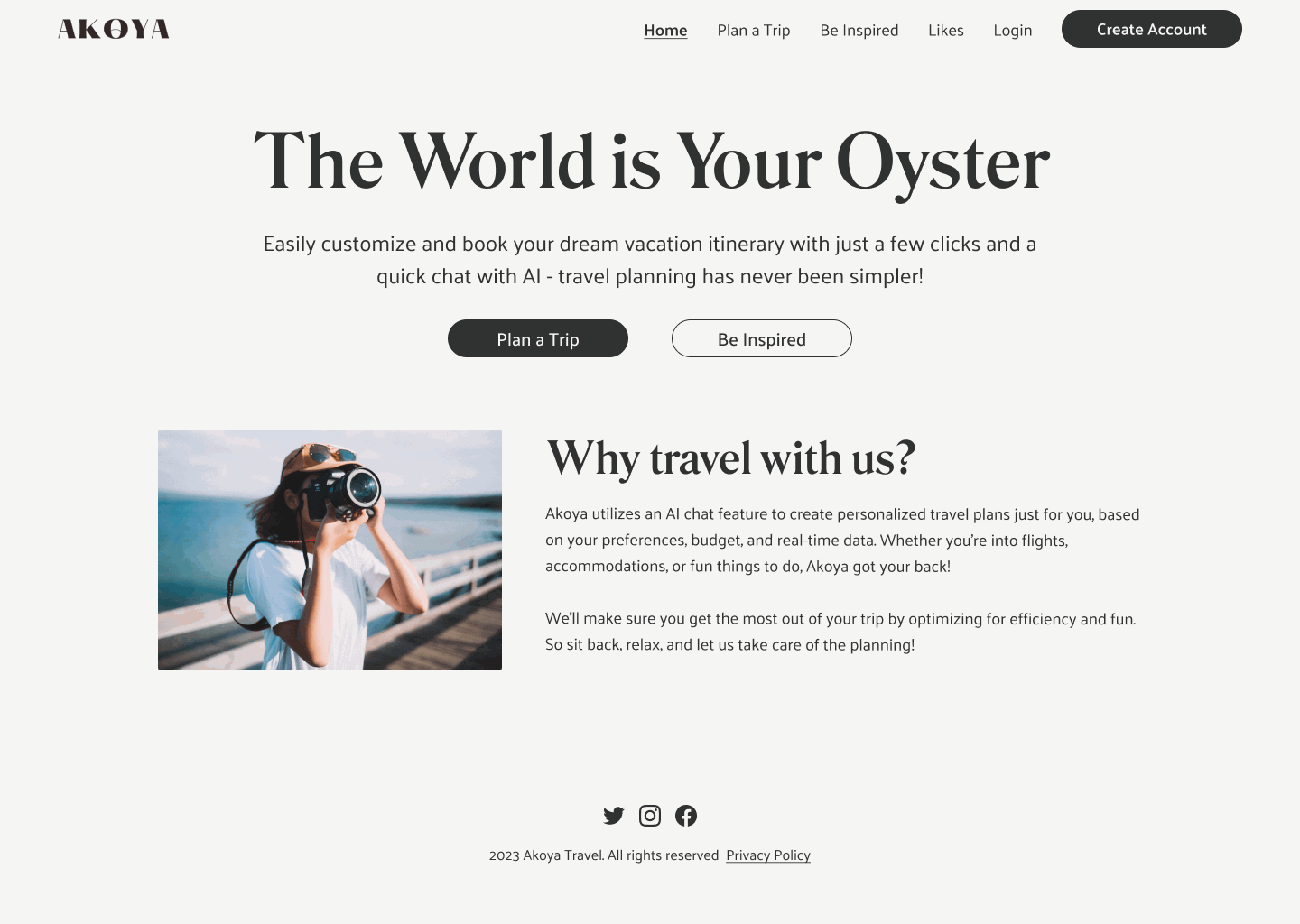
AI-Powered Redesign: Transforming Travel Planning at Akoya Travel
Akoya Travel's mobile experience suffered from information overload and poor hierarchy, hindering users from effectively planning personalized trips. Recognizing this as a critical business and user challenge, I led a redesign, integrating AI to create an intuitive travel planning solution. This initiative significantly improved usability, increasing user satisfaction by 19% and strengthening our market position.
Outcomes
→ 19% rise in user satisfaction
Users found the revamped trip planner significantly more intuitive and personalized, leading to a substantial increase in overall satisfaction.
→ 14% jump in testing success rates
Subsequent rounds of usability testing showed a clear improvement in users' ability to complete key tasks successfully with the new design.
→ 13.9% average decrease in task error rates
Post-redesign testing revealed a significant reduction in errors across critical user flows.
Context
The app desperately needed a smarter travel planning experience
When we began this project, Akoya Travel's web product struggled with an effective and personalized travel planning process. It was characterized by:
Information overload and a lack of hierarchy: Users were overwhelmed with data, making decision-making difficult. (Show an illustration/screenshot of the old UI illustrating this problem).
Confusing user flows: With no clear order, users found it tough to navigate, impacting their overall experience.
Strategic vision: Streamlined, AI-powered personalization
The core goal was to reposition Akoya Travel as a leader in intuitive, AI-driven trip planning. We aimed to set a new standard for how effortless and personalized travel planning could be. Competitors offered fragmented experiences, and a major overhaul was essential to increase user engagement and adoption.
No time to waste (or similar statement of urgency)
The situation demanded immediate action to prevent user drop-off and capitalize on market opportunity. This project required a significant effort to transform the user experience.
The road to Launch
Early mixed signals
We knew that users struggled. Completing simple tasks was tedious and time-consuming. Customers frequently mentioned frustrations with the trip planning modals:
"The modals ask too many unnecessary questions, making AI trip planning less appealing." - Customer Feedback
Kickoff Meeting: Briefly recap purpose and key takeaways, especially competitor analysis and metrics defined.
Existing App Analysis: Detail your heuristic analysis, showing a "Snapshot of Akoya's existing designs" to illustrate findings.
User Testing: A step forward

To truly understand the user experience, we conducted rigorous testing. I worked on designing the test script and interactive prototypes with the team.
Goal: To understand user sentiment for the existing planning process vs. potential new approaches.
Methodology:
15 Usability Tests led by 5 Moderators across 4 Features with 2 Demographics (Retirees 50+ and Gen Z/Millennials 18-30).
We used UserTesting.com and created prototypes from existing wireframes to map user flows. (Show a "Screen design displayed in a mockup" of your prototype).
Formulated hypotheses and established numeric/descriptive metrics.
Results:

Insights were clear: while all participants completed tasks, the 15% average error rate and the feedback on information overload indicated a strong need for change.
Quantitative Results: Detail the completion rates, error rates, time spent, and NPS (72%), and the 2 minor errors found.
Qualitative Results: Summarize findings recorded on Miro, pinpointing recurring themes.
Outcome: "Compiled a comprehensive test findings report to analyze and summarize the results, which became invaluable for the redesign."
Redesign Principles: Our compass
Armed with invaluable insights, we outlined three fundamental principles to guide the creation of our hi-fi screens:
Maintain simplicity & clarity
Highlight personalization
Enhance visual appeal
(Optional: Show a "Snapshot of the findings and recommendations" visual here, linking research to design decisions).
Perfecting the core experience
Now that we understood the issues and defined our principles, for weeks, I prototyped, tested, and repeated, focusing on designing a solid core experience.
Iterative Design: As designs improved, we continually validated our changes. This phase involved creating over 50 unified high-fidelity screens, integrating client input. (Show a selection of your High-Fidelity Screens here as a gallery).
Design System Effort: As Akoya's design needed cohesion, I took the opportunity to kickstart a design system effort to deliver a cohesive end-to-end experience:
Simplified the style guide (e.g., cutting down excessive color choices).
Created a consistent set of reusable components.

We looked at all edge cases, ensuring smooth functionality. We were ready for a soft launch.
A long-awaited launch
The team worked really hard, and we were so excited for customers to try the new experience!
Solution 1: New streamlined trip creation
(Before)

(After)
Key Improvements:
Reduced Information Overload: Streamlined text input fields from 7 to just 3 (location, hashtags, notes).
Improved User Experience: Eliminated email and budget fields, making number of travelers and dates optional.
Consolidated Flow: All trip planning queries now housed within one popup modal.
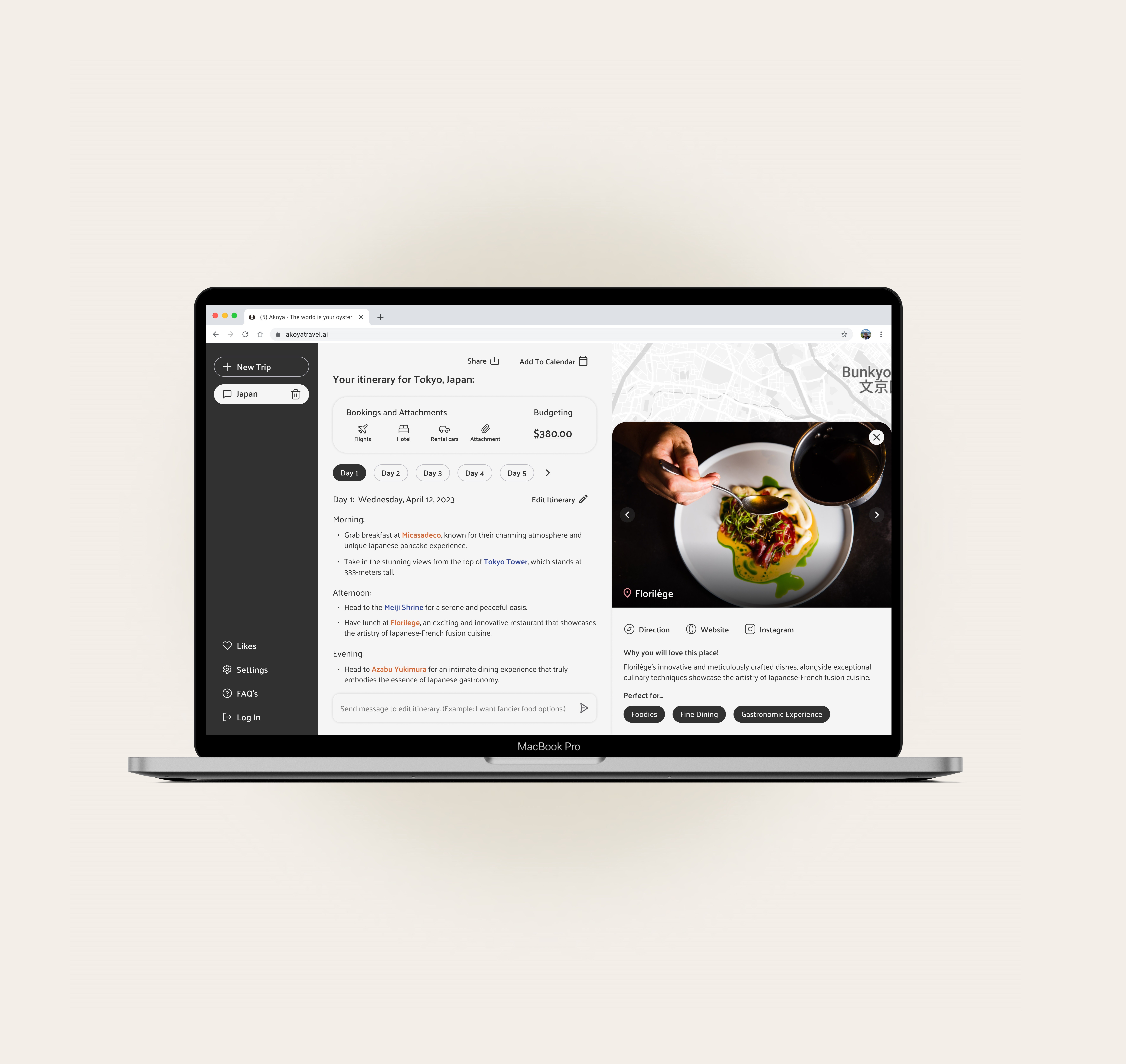
Solution 2: Intuitive Itinerary View
(Before)

(After)

Key Improvements:
Simplified Layout: Transitioned day-by-day display from a vertical to a horizontal format, bolstering information hierarchy.
Concise Content: Details now presented in crisp bullet points, easing cognitive pressure.
Personalized Recommendations: Clicking on a location image brings up a detailed pop-up view with pertinent links and rationale.
Solution 3: Empowering User Control & New Features

Key Improvements:
Enhanced Flexibility: Introduced a flexible "Edit View" allowing users to delete, regenerate, or add items to the itinerary.
Seamless Management: Preserved familiar left navigation for easy trip creation and modification.
Efficient Collaboration: New 'share' function and 'add to calendar' option. (Show images)
Streamlined Management: 'Bookings and attachments' for consolidated details, 'Budgeting' for expense tracking. (Show images)
Enriched Experience: Integrated a map view for context and visual exploration. (Show image)
Solution 4: Refined Brand Identity
(Before Visual) (Show the old pink/azure color scheme/UI example)
(After Visual) (Show the new beige, charcoal black, and midnight blue palette/UI example)
Impact: A new color blend lending elegance, simplicity, harmony, and sophistication, replacing the original scheme that hindered readability and brand attributes.
Thank yous
The 8-week redesign was a huge team effort. Big congrats and thank you to everyone involved.

