Redefining AI Website Creation for Non-Technical Users
Butternut's advanced AI website builder struggled with complex interactions and a confusing structure, preventing non-technical users from effectively creating their desired websites. Recognizing this as a critical barrier to market growth and user adoption, I led the transformation of the application, focusing on intuitive AI interaction design and a scalable design system. This initiative significantly improved user satisfaction and efficiency, boosting post-task satisfaction by 40% and making AI website creation accessible to a broader market segment.
ROLE
Ld. Product Designer
TEAM
Founder, CEO
Product (2)
Engineering Lead
Outcomes
→ 40% rise in AI customization satisfaction
Users achieved significantly higher satisfaction with the templated prompt approach for AI customization. This validates the effectiveness of an intuitive AI interaction model for non-technical users, driving higher product adoption.
→ 65% improvement in task completion for core editing functions
The dual-toolbar system drastically improved users' ability to discover and use editing features. This directly translates to increased user efficiency and engagement, reducing friction in the core value proposition.
→ From 54% to 81% user satisfaction (via post-task survey)
A substantial increase in overall user satisfaction, reflecting a more intuitive and empowering website creation experience. This indicates strengthened user loyalty and positive brand perception.
→ 86% satisfaction rating for Theme Explorer
The innovative "style explorer" interface achieved high user satisfaction, balancing design flexibility with ease of use.
Context
Butternut's advanced AI website builder struggled with an effective and personalized website creation process.
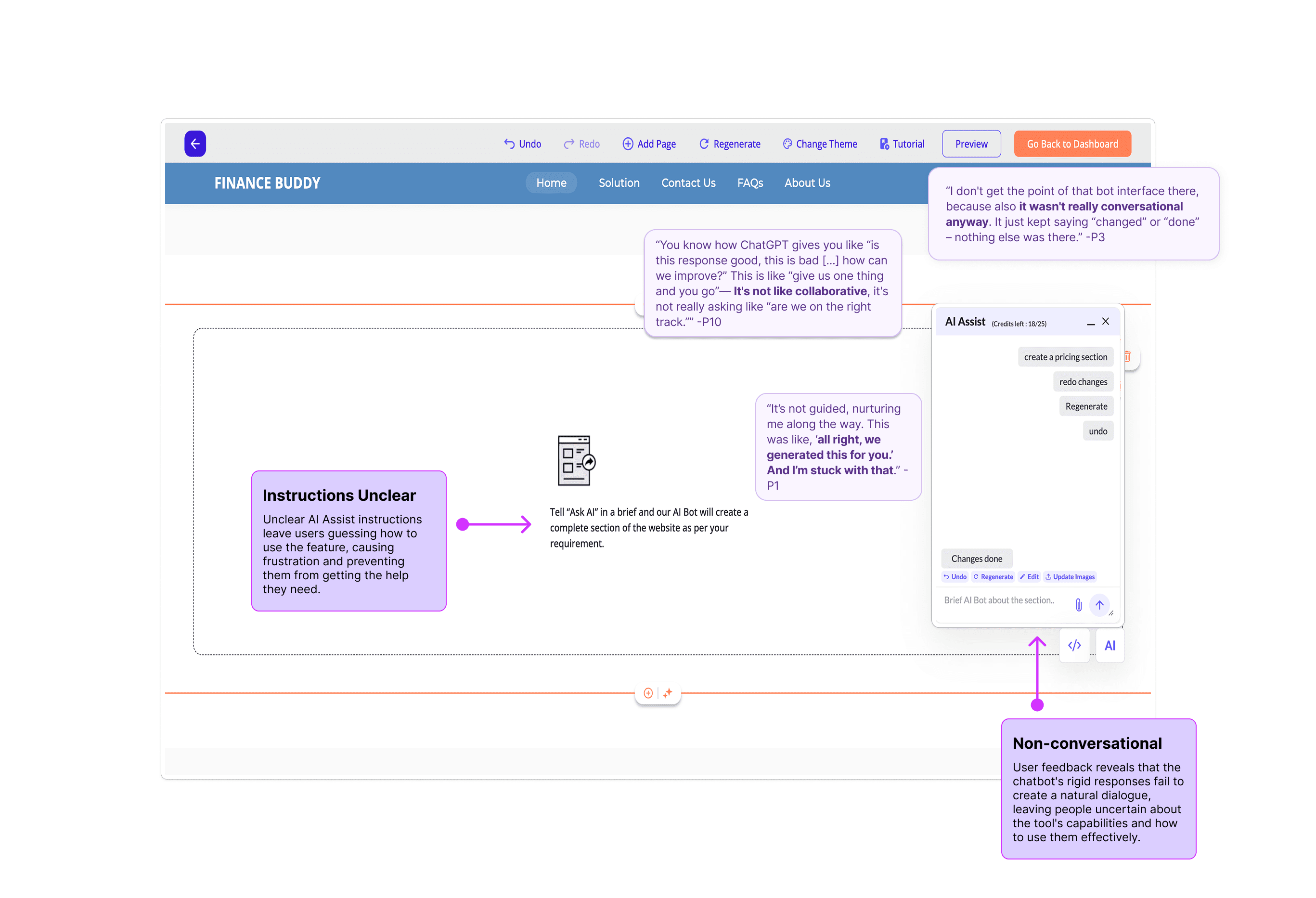
AI Interaction Design Crisis: Users struggled to communicate effectively with the AI, lacking context and guidance in text inputs. This led to frustration, wasted effort, and inability to achieve desired website outcomes.
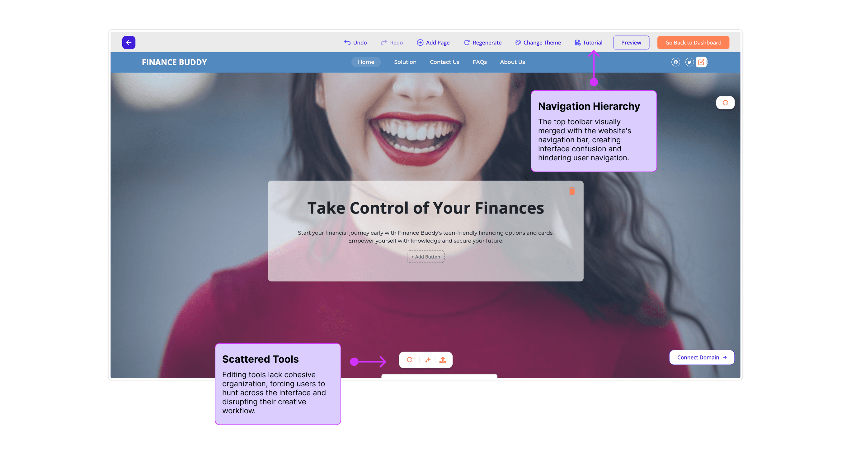
Information Structure & Feature Discovery: A direct editing workflow, while unique, hid critical functionality across 15+ features, making the tool feel overwhelming and unusable.
Design System for Global Users: Limited customization options led to design homogenization, a competitive vulnerability for diverse global users who needed personalized aesthetic control without decision paralysis.
Vision: Democratize AI Website Building
Our goal was to reposition Butternut as the accessible leader in AI website creation for small businesses, specifically those lacking technical resources. This aimed to simplify complex AI interactions, empower users with intuitive tools, and set a new standard for efficient, personalized website development.
Urgency: Capture Underserved Market Segment
The market presented a significant opportunity: 23.5% of US small organizations wanting websites but lacked technical resources. The situation demanded immediate action to address these fundamental barriers, preventing user drop-off and securing Butternut's position in a rapidly evolving market.
The Road to Launch
Phase 1: Deep Dive - Research & Definition
Problem Validation & Kickoff: User feedback and internal analysis confirmed widespread struggle with existing planning modals: "The modals ask too many unnecessary questions, making AI trip planning less appealing." I led the kickoff, aligning stakeholders, analyzing competitors, and defining success metrics.
Existing App Analysis: Our heuristic analysis of the existing app revealed core design deficiencies.
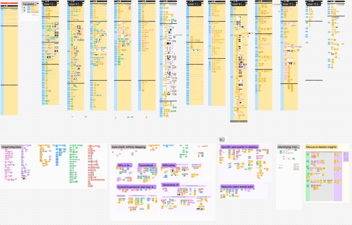
User Testing: Validating the Need for Change To ground our work, I designed and led rigorous usability testing with the team, creating scripts and interactive prototypes. Our goal was to understand user sentiment for existing vs. new approaches.
Methodology: 15 usability tests (5 moderators, 4 features, 2 demographics: Retirees 50+ / Gen Z/Millennials 18-30) were conducted via UserTesting.com. We mapped flows with prototypes, formulated hypotheses, and established metrics.
Results: Insights were clear: despite task completion, a 15% average error rate and consistent feedback on information overload mandated change. We identified critical design gaps.
Quantitative: Detailed completion rates, error rates, time spent, NPS (72%), and 2 minor errors confirmed issues.
Qualitative: Miro-recorded findings revealed recurring user frustrations and unmet needs.
Outcome: A comprehensive test findings report provided an invaluable blueprint, directly informing and validating our redesign principles.
Phase 2: Core Design Principles
Armed with research insights, we established core design principles to guide all high-fidelity development:
Standardize AI Interaction: Create consistent, guided communication patterns for all AI features.
Balance Simplicity & Power: Preserve direct editing while enhancing discoverability and organization.
Scalable Customization: Offer professional presets while enabling advanced customization without overwhelming non-designers.
Perfecting the Core Experience
With principles established, I led an intensive, iterative design process, focusing on a robust and scalable core experience.
Rapid Prototyping & Testing: Started with 8 different interaction models, narrowing to 3 for testing. Built high-fidelity Figma prototypes to simulate workflows and observe feature discovery.
AI Interaction Testing Framework: Developed a comparative testing approach to evaluate experimental AI capabilities, using risk/reward analysis and user validation data.
Iterative Design: Over 50 unified high-fidelity screens were created, integrating client input and continually validating changes.
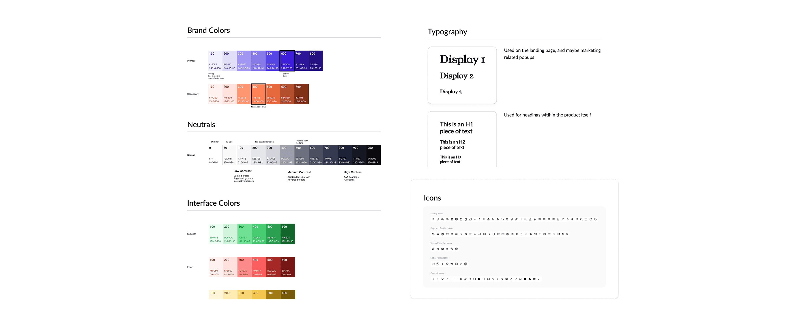
Design System Initiative: I initiated a comprehensive design system effort, creating a complete component library and design standards. This enabled team scalability and consistent design development, addressing global market needs.
We addressed all edge cases, ensuring smooth functionality and preparing for a confident soft launch.
Launch & Impact
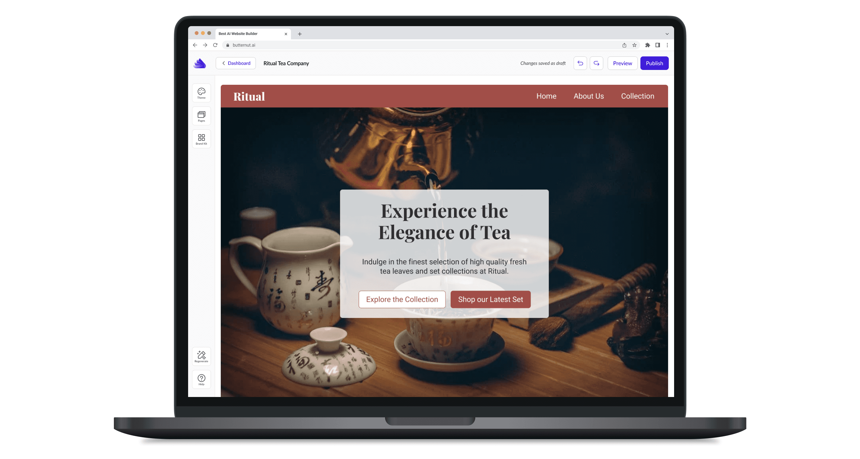
Solution 1: Standardized AI Interaction Design
Before
After
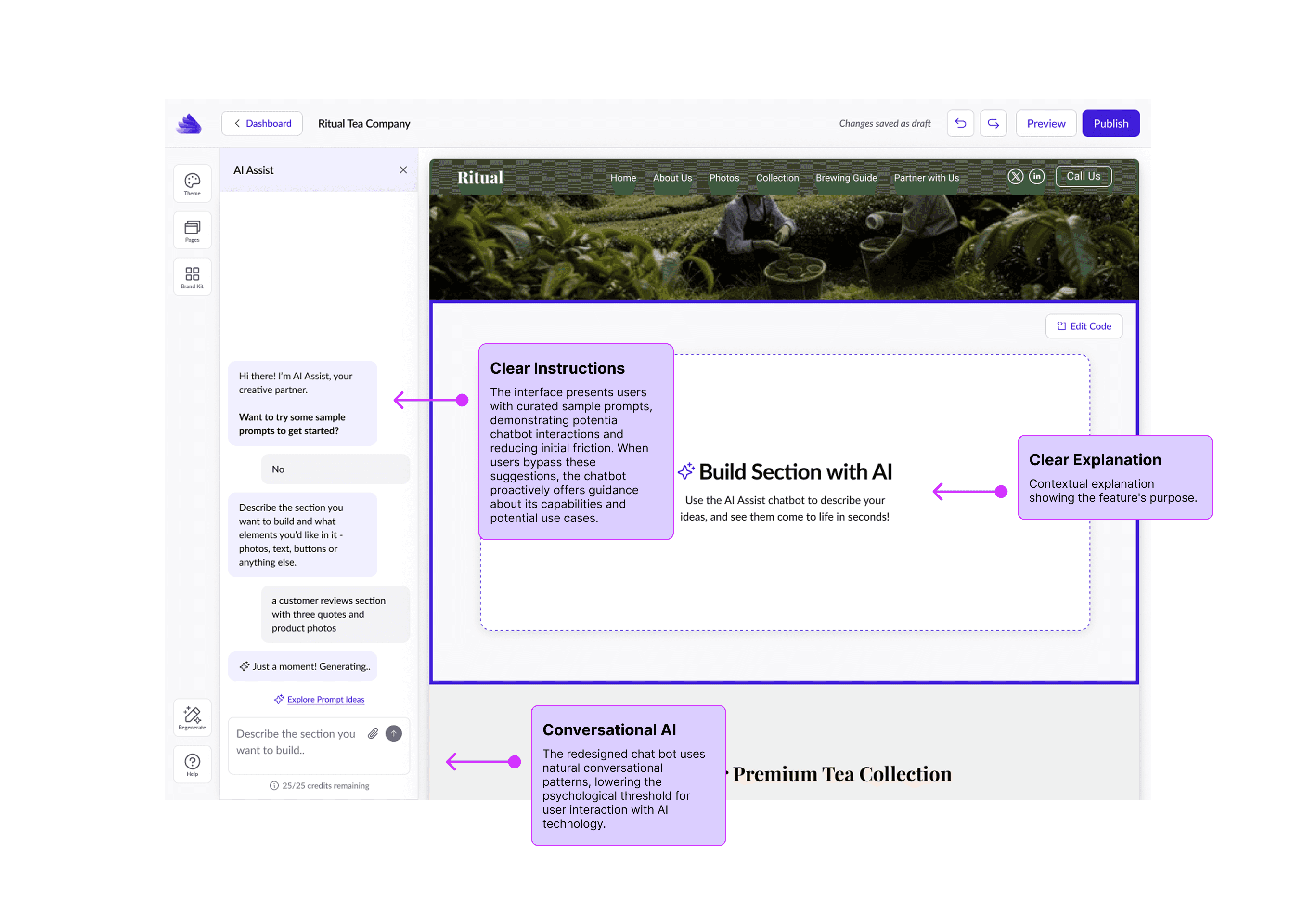
Templated Prompt Approach: Advocated for and implemented templated prompts, showing users what websites they could build and guiding effective communication with the AI. User testing showed 40% higher satisfaction and 60% faster AI customization tasks.
Scalable AI Interface Patterns: Designed a templated prompt structure that standardized user communication across multiple AI capabilities, creating consistent interaction patterns.
Collaborative AI Assist: Redesigned the AI Assist chatbot for ongoing editing, providing feedback, explanations, and a library of prompt examples, making it truly collaborative.
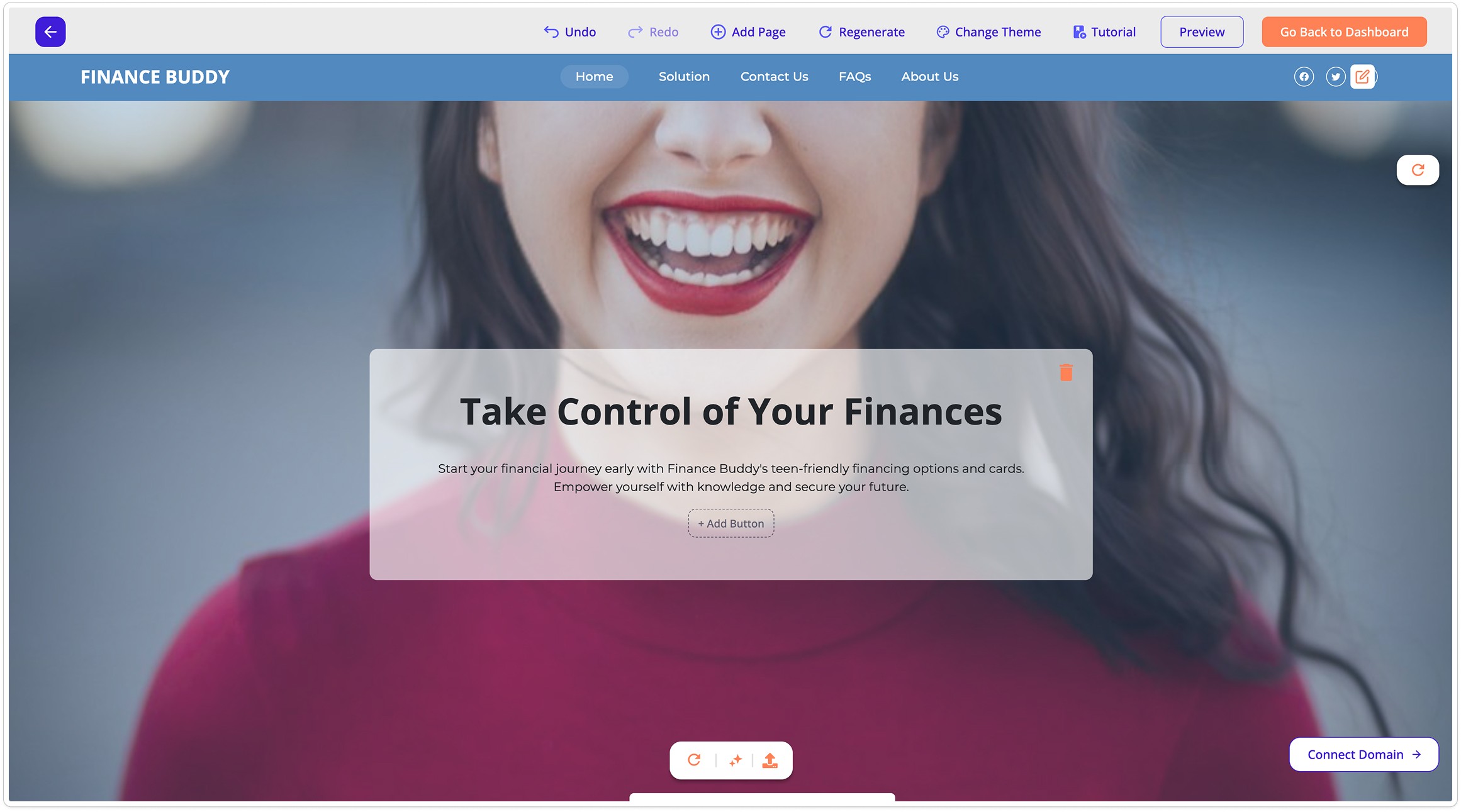
Solution 2: Intuitive Information Structure & Feature Discovery
Before
After
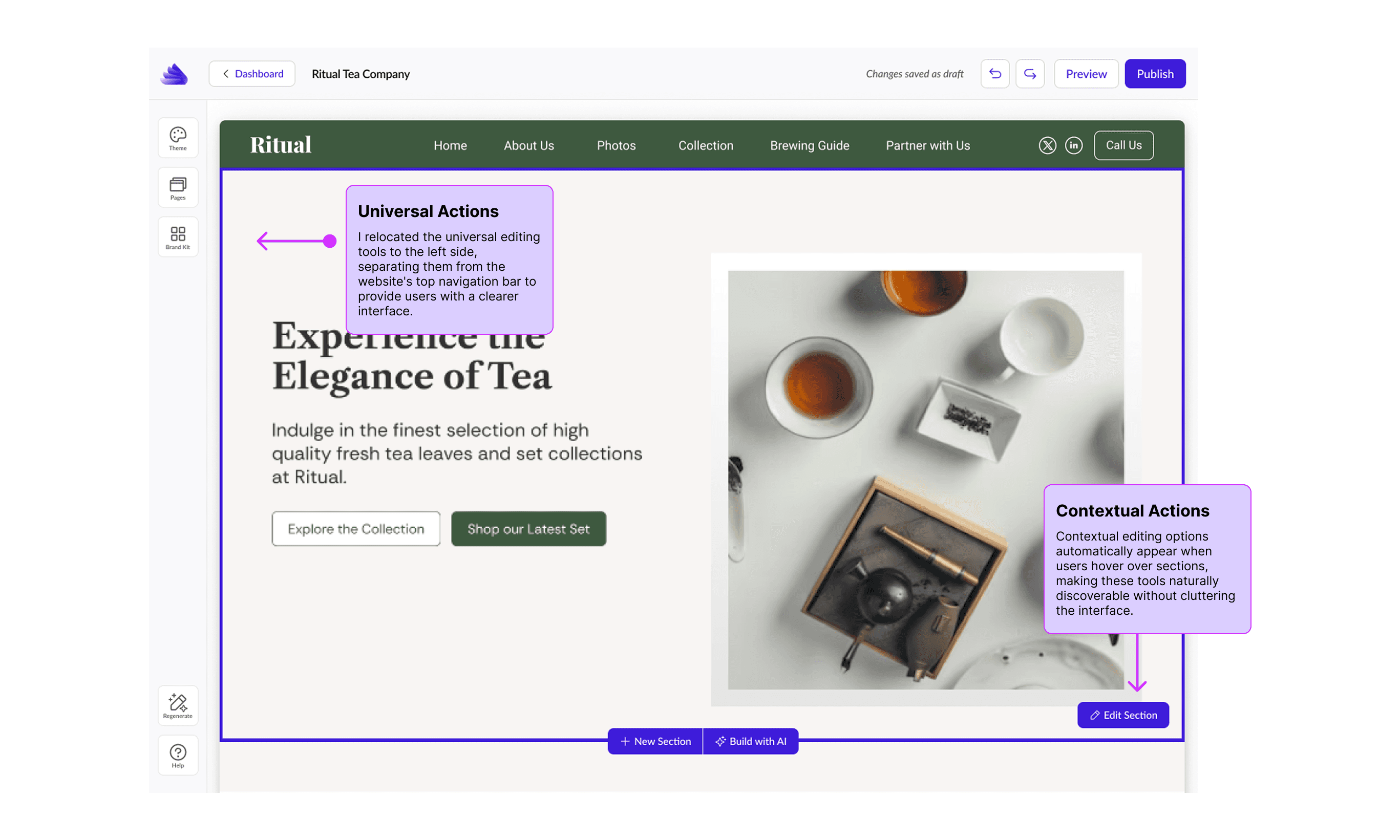
Dual-Toolbar System: Implemented a persistent universal toolbar (left sidebar) for website-wide editing and a contextual toolbar (dynamic panel) for element-specific features. This balanced persistent access with contextual relevance, improving task completion by 65%.
Universal/Contextual Feature Structure: This information organization supports product growth without overhead, making features discoverable without overwhelming users.
Solution 3: Progressive Customization Model & Design System (Before Visual) (Show limited/homogenized customization options) (After Visual) (Show style explorer/curated theme options)
Curated Design Collections: Rebuilt Butternut's theme structure with 12 professional design collections, balancing variety with simplicity.
"Style Explorer" Interface: Designed an interface allowing users to preview complete theme variations with a single click, using their content for tangible decision-making.
Comprehensive Design System: Documented clear usage guidelines, interaction states, and responsive behavior rules, becoming the foundation for all future design work and supporting global scalability.
Market & Organizational Impact:
Market Impact: By making AI website building accessible to non-technical users through better interaction design, Butternut addressed the 23.5% of US small organizations wanting websites but lacked technical resources.
Organizational Impact: I delivered foundational design patterns that became Butternut's single source of truth. My research synthesis became a template for future user studies, and the component library enabled consistent design development and team scalability.
Acknowledgements
Acknowledgements This transformation was a collaborative effort. My sincere gratitude and congratulations go out to every talented individual involved in bringing this vision to life.

